Future Radar
Goal
Create a new & improved user-friendly UI for The Weather Channel’s award-winning Radar feature, with cross-platform alignment for iOS, Android, & Web.
Role
Lead Product Designer
Softwares
Sketch | Invision | Jira
Duration
Jan 2021 - Jan 2022
Overview
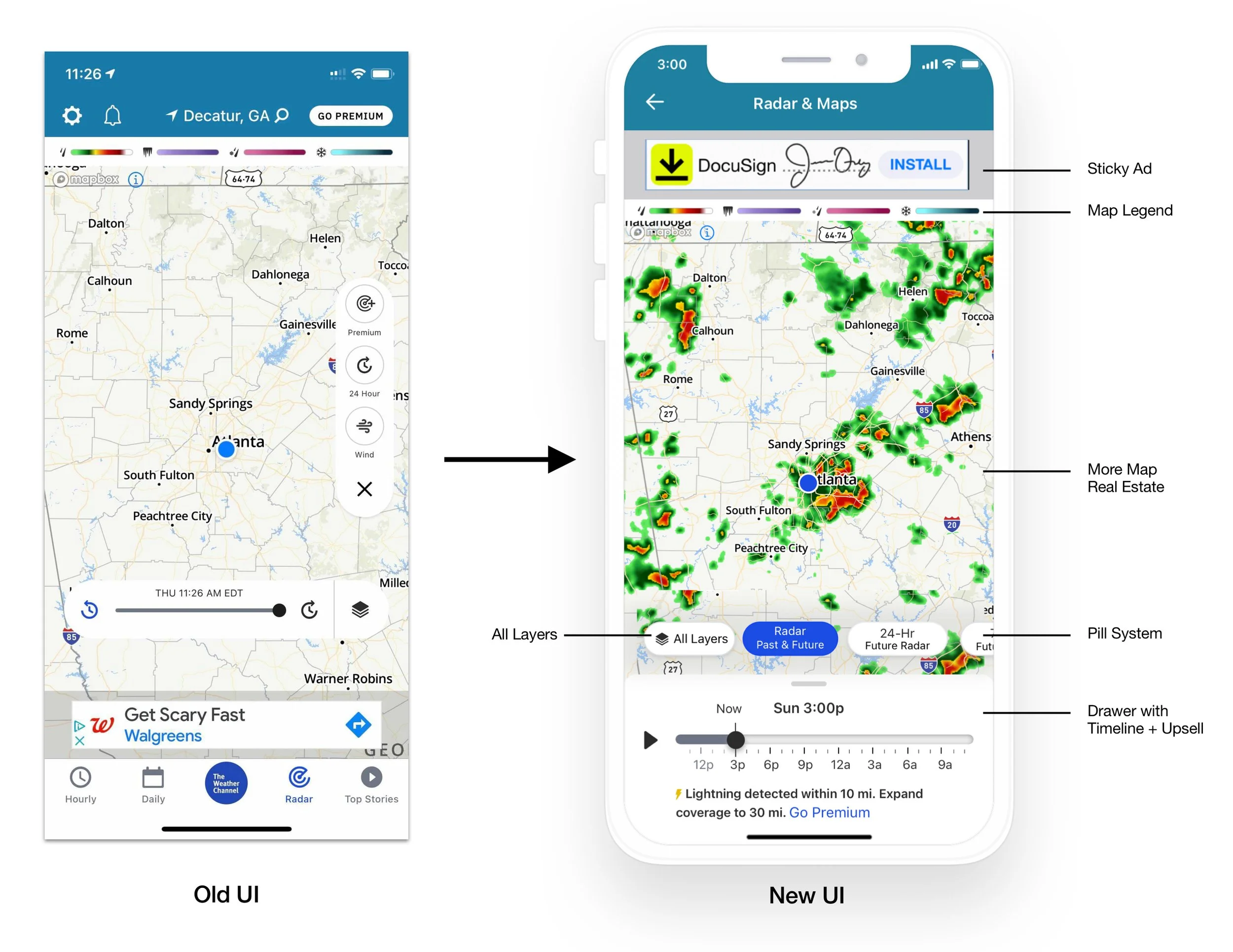
Reading through user feedback, we realized that there were a lot of holes in our existing Radar page. Users did not know how to use the timeline, they do not know how to access layers, and so many of our differentiators were hiding behind a button they were not aware of. This project aimed at fixing these issues for our users by adding value to their experience, ultimately building equity in the drawer for everyone. The aim was to update and modernize the Radar Experience, cross-platform. Educate, inform, and inspire users through the nexus of storytelling, data, and innovation to make our brand the market leader for value and perceived accuracy for our overall precipitation story.
What Changed?
Layer Awareness: Introducing Pills
Timeline Usability: Unified Scrubber
Map Real Estate: Collapsed + Full-Screen States
Upsell Opportunites: Within Drawer + Onboarding
Future-Proof UI: Addition of 72 Hour Radar
GPS: New Feature
“Why did we invest in this redesign? Radar usage within our app increased almost 2.5x, from 100M to 250M per month. We believe that radar is our single biggest opportunity to solve in a competitive weather market landscape. ”
— Head of Consumer Product, Watson Advertising and Weather
Increasing User Value
Allowing the map to shine through better by removing the floating action button + timeline.
Introducing a Carousel Pill System, featuring four default pills:
- Basic 8 Hour Radar
- 24 Hour Future Radar
- Upsell to 72 Hour Future Radar
- Layers / Overlays / Map SettingsBuilding equity within the drawer by adding the timeline + upsell to encourage users to purchase a Premium Subscription.
Drawer States
The newly designed drawer became a great storytelling tool for our users. We added editorial content in severe weather or upsells to Premium Subscriptions within the new drawer, to build equity.
Cross-Platform Compatibility
We made sure to address these UI changes amongst all our products, including our iOS App (iPhone + iPad), Android App (phone+tablet), and Website (Desktop). Sure, it was a LOT of Sketch prototypes, but totally worth it.
Onboarding
To bring awareness to the new UI, we introduced helpful onboarding tooltips within the experience. This allowed us to tell a better story and walk our users through a new experience so that they don’t feel overwhelmed. We also introduced a new GPS feature, that allows users to get back to their original state after interacting with the map. The GPS icon only appears if the user moves away from their current location.
Takeaways
I had the opportunity to collaborate with a bunch of talented Developers, QA Engineers, and Product Managers, plus present to Leadership during this project. I especially enjoyed the real-time screen share sessions I had with numerous devs to get every design pixel-perfect because our users deserve nothing less. I am very proud of our end result and efficient teamwork.


